The Story of Lewerentz

In 1930, the world-renowned architect Sigurd Lewerentz designed an office building and warehouse for Philips on Gävlegatan. Today, in that same building, we have had the honor of collaborating with the distinguished architects at Wingårdhs to create a hotel whose design concept is rooted in Lewerentz’s history and the legacy he left behind.

The distinctive warehouse from 1930 is a beautiful concrete building with a strictly repetitive façade and several small windows. Simplicity, elegance, a clear design language, and a focus on material selection are hallmarks of Lewerentz’s buildings.

"The magazine was designed by the 'master of masters' of architecture. At first, the task felt a bit daunting, but then it felt like a dream come true. Being able to study and draw inspiration from Lewerentz’s attention to detail, design language, and choice of materials up close was a true joy."
says Helena Toresson, Deputy CEO at Wingårdhs

Today, nearly 50 years after Lewerentz’s passing, international interest in his architecture is growing. His eye for detail and ability to strip away the superfluous fascinate architecture enthusiasts around the world. In October 2021, ArkDes will open a comprehensive exhibition on the Swedish architect’s life and work.

Stay overnight

If you want to experience the energy of Lewerentz’s architecture, visit Blique Nobis and stay at Magasinet, which was designed by Lewerentz.

OUR VISUAL IDENTITY

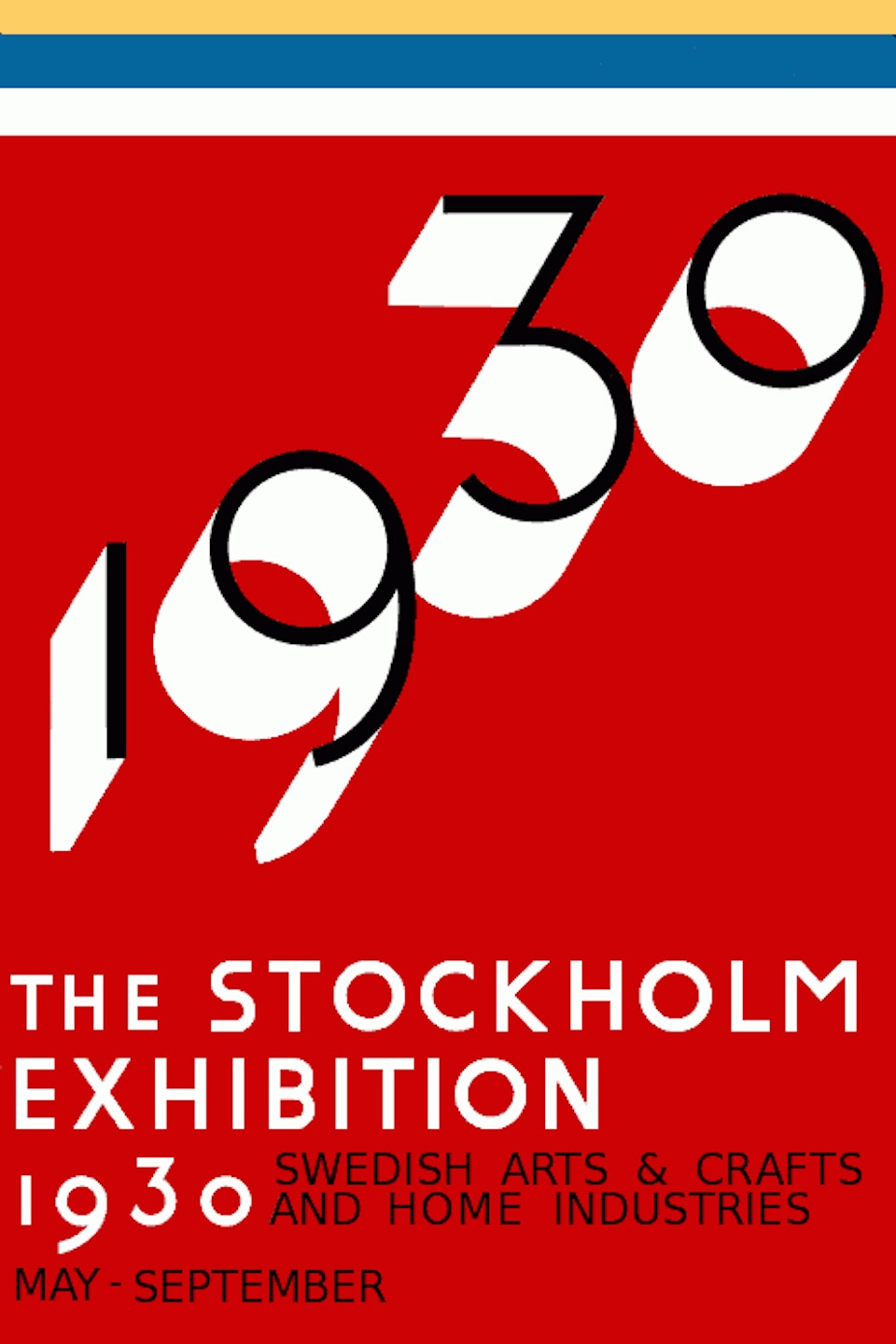
Lewerentz is also a visual presence throughout Blique Nobis’s graphic identity. The typeface used in the hotel’s logo and printed materials is inspired by the typeface Lewerentz himself designed for the 1930 Stockholm Exhibition—the same year he designed the buildings that now make up Blique Nobis.

A collaboration between the type foundry Letters of Sweden and Fredrik Gruber in 2016 resulted in the Funkis typeface. The characters are strongly inspired by the letters Sigurd Lewerentz created for his poster for the Stockholm Exhibition in 1930. This event had a major impact on architecture and interior design in the years that followed and is considered the breakthrough of functionalism in Scandinavia.

"We naturally chose Funkis for our logo, and that’s where we found a graphic foundation to build on. Color is a key part of our visual identity, and the color combination we settled on is inspired by the functionalism typical of Lewerentz, but with a modern Blique."
says Alice Garpenschöld, graphic designer Blique Nobis

On the right, you can see the famous poster for the 1930 Stockholm Exhibition. Take a close look at the typeface and compare it with the one we use in our headlines to see the similarities.

FUN FACT - MEETING ROOMS

As a tribute to Lewerentz, we named all 11 of our event and conference rooms after buildings from his portfolio—such as St. Mark’s Church in the Stockholm suburb of Björkhagen, St. Petri Church in Klippan, or the Röda Bergen area right next to Blique Nobis, where Lewerentz sketched out the urban plan in its early stages.